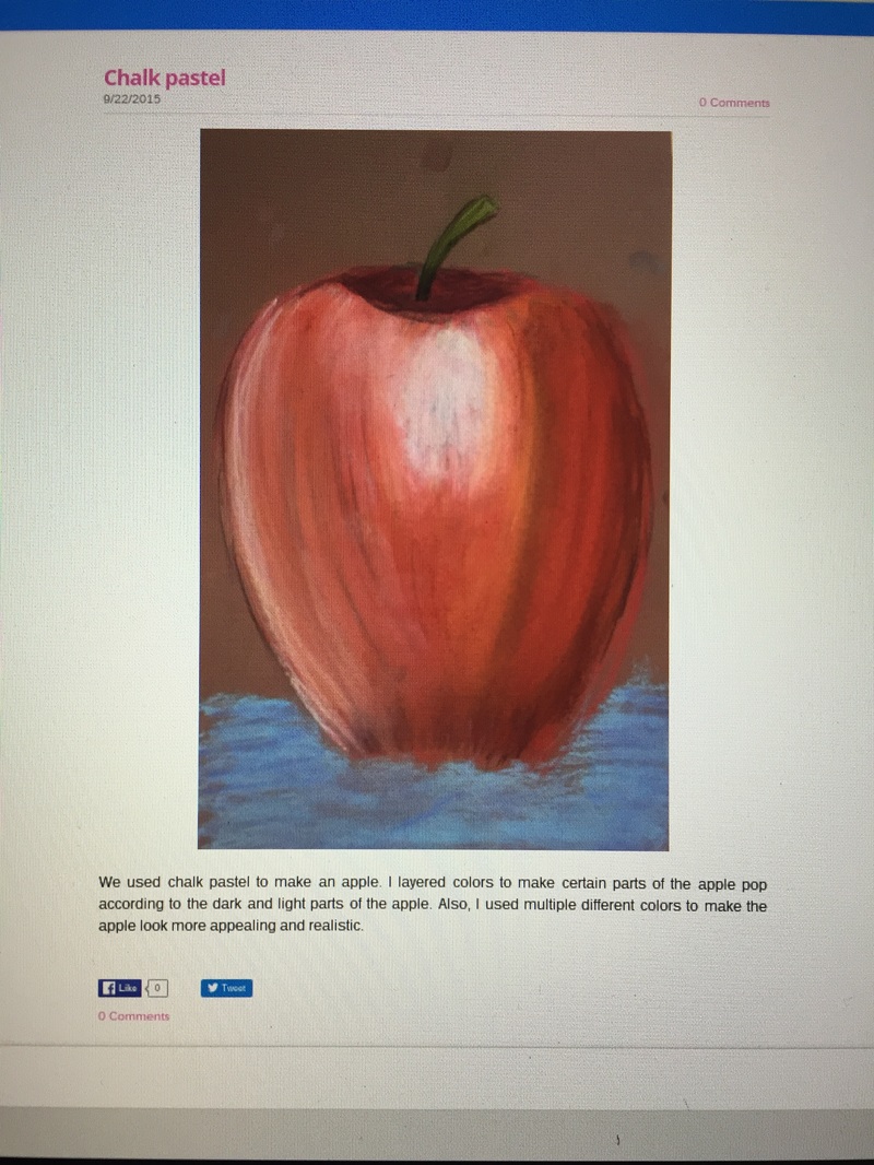
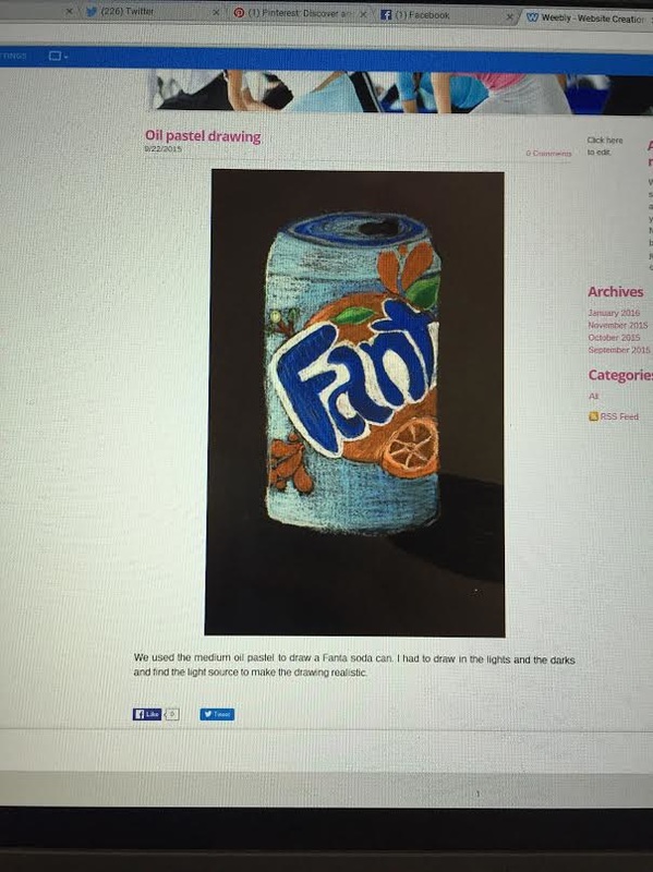
I think that these two mini lessons were most beneficial for me because they taught me how to shade with other mediums other than pencil. I liked doing these big "mini" projects because it t
|
I think that these two mini lessons were most beneficial for me because they taught me how to shade with other mediums other than pencil. I liked doing these big "mini" projects because it t
0 Comments
Which project was most successful? Describe the theme and or topic and the process you went through to complete the project. Were the choices you made regarding material, size, technique ect. beneficial to enhancing this project? Please explain. My favorite project was the first project that we did which was the perspective drawings. I think that this project was my favorite and most successful because i really enjoyed the medium i used which was pencil and i liked drawing logos of the cereal boxes. This was also the project that i spent the most time on, and also the only project that i took home to complete. It was one of the only projects where I really enjoyed everything about it, like using pencil, drawing the perspective, drawing the logos, and i really wanted this project to look nice. I wanted to do cereal boxes because i had just eaten cereal that day and i was in a cereal mood and i was thinking about all of the cereals i wanted to eat and with perspective i wanted to make a town so i combined my ideas together to make a cereal box town. I chose all of the cereals that i love and i put them all in my piece. I think that choices i made with the size of my paper was a good choice cause it was a more horizontal long piece of paper that really captured the towns perspective and allowed me to add as many cereal boxes as i wanted to have and allowed me to add the sidewalk and the road. I like perspective drawings a lot because they make you think a lot and when they are done they look so cool. They look almost 3D in a way and its very appealing to look at. I think that this project really captured what i can do as an artist, i like the way it turned out and i would definitely do another perspective pencil drawing again.  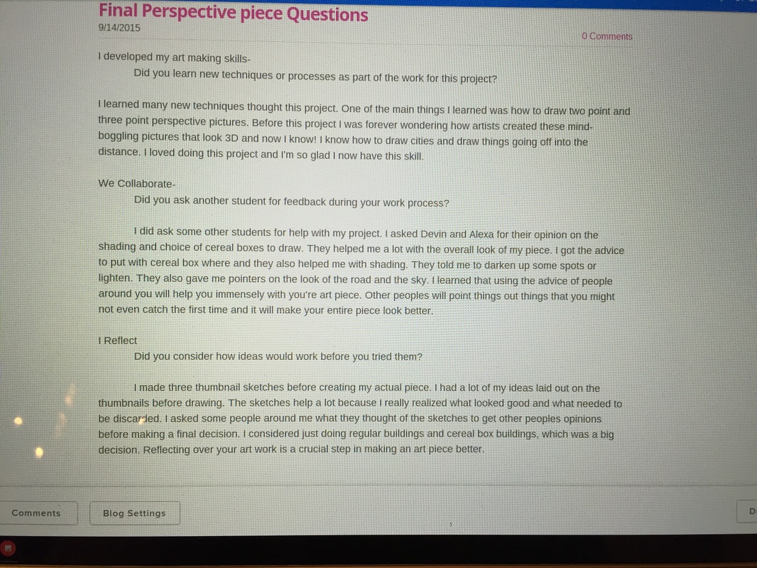 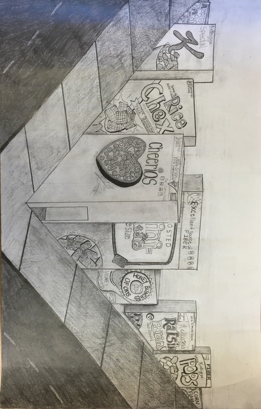 This was the blog i did for the first project which was the perspective project. Overall i liked this project, i thought it was one of the more fun projects that we did. There were many challenges that i faced while doing this project tho, like before i started, i didn't know how to do two point perspective or three point perspective or any other perspectives so starting from knowing nothing was a definitely a challenge. Another challenge i had was doing the values with the pencil on the sidewalk and roads. Getting the dark pencil color the entire road was hard and trying to make it all one solid dark pencil color. The ombre in the sidewalk going from dark to light in the center was hard because at some points i would press down too hard with my pencil and would have to go back and lift some of the darker color up to make the colors flow more. This project took me longer than any project i have done in this class, this was also the only project that i have taken home to do and work on. It took me a long time to draw all of the cereal box logos and make the values right with the shades and lights. The hardest part about this project was drawing out the outlines for all the boxes and making them all go to the same vanishing point which was nit on the page, it was off the page which made it more difficult. Making some of the boxes stick out more than others and some taller and fatter than others was very difficult as well. When i came across problems, like when my perspective looked off or my lines weren't straight, there was nothing else i could do but erase and redo them. Getting frustrated is never good you just have to go with what you got. In my original plan, i wanted to have busy streets and spoon light posts, but i ended up taking that part out of my plan. I wasn't sure how to draw cars that would fit the perspective or how to make the spoons fit the perspective either. The original plan i thought would have looked maybe a little too fake instead of clean and neat. I want my art work to be appealing and neat to look at. My drawing was not suppose to look realistic, it was suppose to look like a made up town with cereal boxes as buildings, i wanted to create something fun and interesting instead of the normal house or city. With the logos of the boxes and the way the boxes or buildings are layed out in perspective, i think that people will be able to tell what my drawing is, which is a cereal box town. In my drawing i think that the use of pencil was a good medium to use for this project. It allowed me to add the shading i wanted to have in the buildings, for example around the buildings where the sun did not hit them all all was dark and near the top of the buildings where the sun would hit the most was lighter and i think that that is more appealing to the eye than just plain solid colors. It also make the drawing look more realistic and like a town more than just a bunch of boxes. The fact that my buildings resemble cereal boxes i think is an eye catcher. It draws peoples attention in to it and makes people take a step back and think wow its kind of cool that they are what you wouldn't normally think a town would be depicted as. With the different logos and the use of shading i think that people will want to look at my piece for a long time. I believe that the boxes draw attention in to themselves and that they are pleasing to look at. When you first look at this piece you will notice a Cheerios box front and center facing left and from there your eyes will go outwards to the surrounding cereal boxes and maybe even the dark road or the ombre sidewalk. your eyes will look at multiple different types of cereal all in one town. With my drawing i would like to have people walk away and think about how they can take any everyday things and make them into something extraordinary.
|
AuthorWrite something about yourself. No need to be fancy, just an overview. ArchivesCategories |
 RSS Feed
